It’s day 1 of 30 days of PowerPoint, and today let’s chat about gallery walls. I love a good gallery wall but let’s be honest... they can be overwhelming to get right. How can I buy the art I want without knowing what other pieces it will fit with? I wanted Pinterest gallery wall dreams to be a reality. So when I moved into my apartment last year, I planned out the entire gallery wall I had in mind before buying any art.
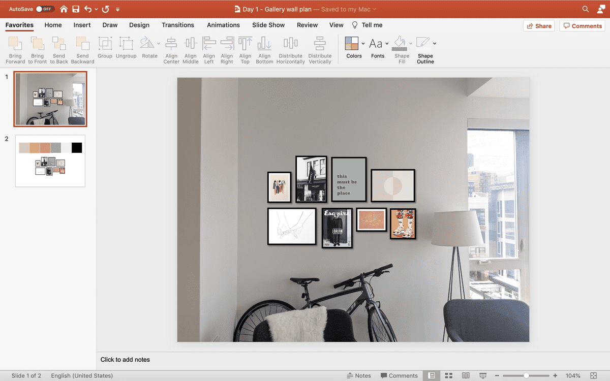
In PowerPoint, I was able to test out different color combinations, sizes, and arrangements before I committed to buying anything. By the time I did buy the artwork I wanted, I knew exactly how it would fit together on the wall behind my couch.
On top of that, I was able to use the eyedropper tool in PowerPoint to play around with the color palette I wanted for my apartment. I was on a mission to get the aesthetic just right ✨
This plan is pretty easy to recreate, so let’s dive into it.
Part 1: Inspiration
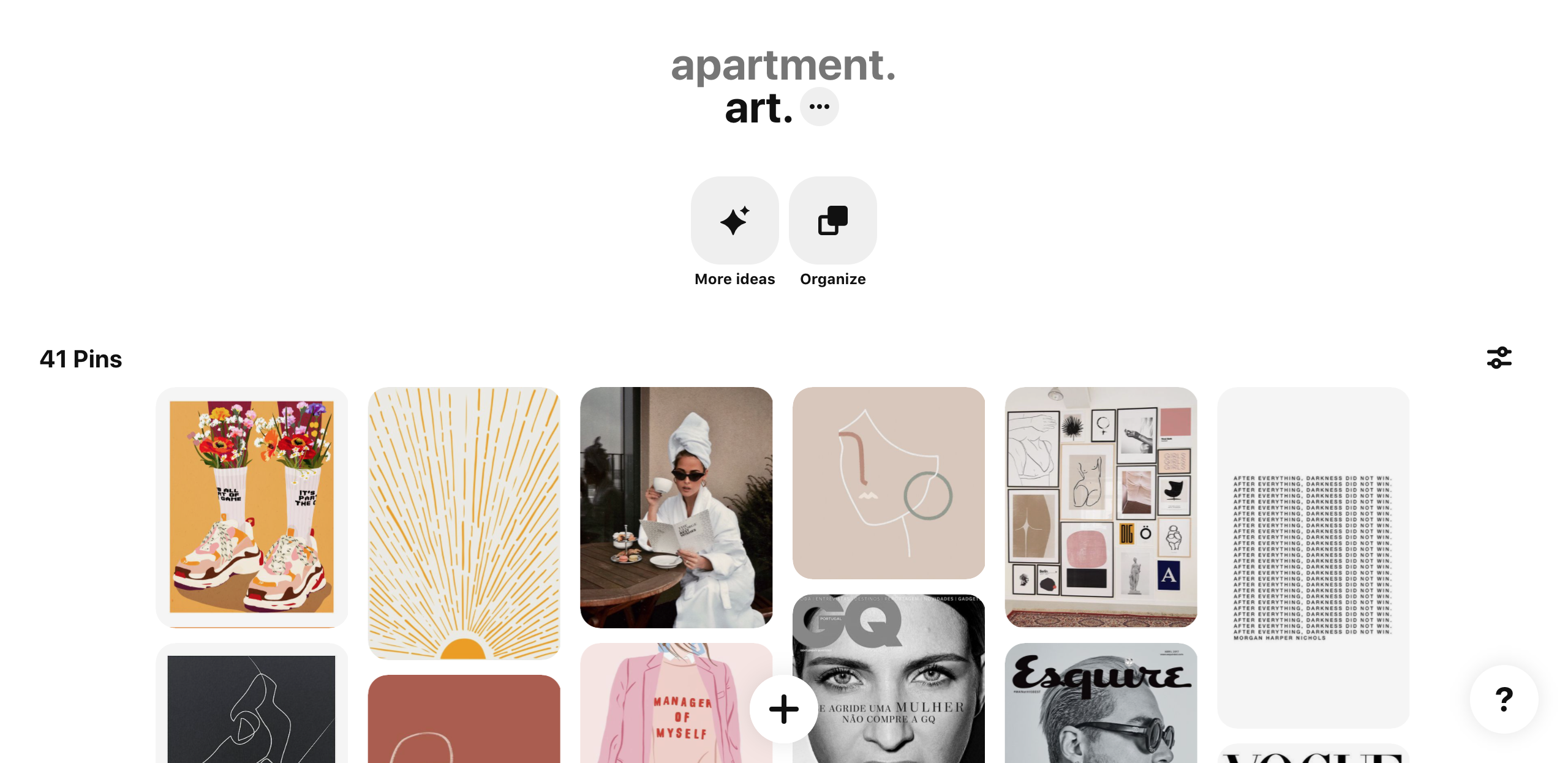
Before opening PowerPoint, you should have an idea of the type of art you’re considering. I did this by taking my time exploring Pinterest and saving ideas to a specific board for my apartment art.

Part 2: Arranging the art
Once you have a handful of pieces in mind, take a picture of your wall straight-on and send it to your computer.
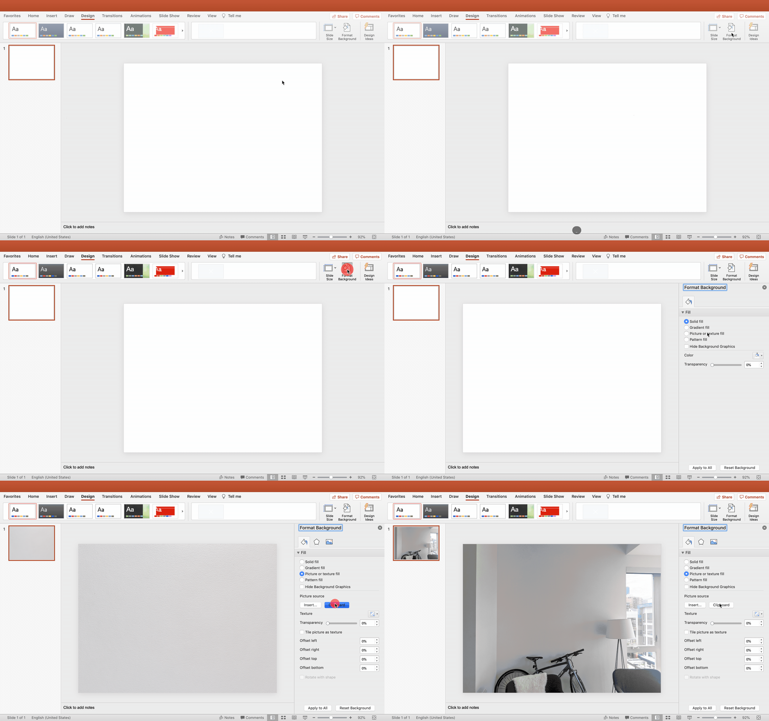
Open a new PowerPoint and set the picture you just took as the background. You can also paste the picture into the slide, but I’ve found that setting it as the background helps prevent me from accidentally moving it later.

After setting your background, copy and paste the pictures of the art you saved in part 1 into the slide. For sizing each picture, I just eyeballed it. To be more exact, you could look up the sizing options of the art you’re considering and resize the pictures to the same ratio.
Now that your art is in the slide, it’s time to start planning. Play around with different art pieces and arrangements until you’re happy with the look. Don’t forget if there are multiple sizes sold for the artwork you’re considering, size is another variable to experiment with.
To really envision the way my gallery wall was planned, I wanted to see the artwork in frames. Thankfully, it’s easy to do in PowerPoint. Click and drag to select all the pictures and then add an outline to them for a framed look. I used a black, 3pt line for mine.
Part 3: Creating the color palette
I was starting with an empty apartment when I planned my gallery wall, so I wanted the wall art to act as an anchor for the rest of the furniture I’d buy. To serve as a guide, I extracted a color palette from the gallery wall artwork using the eyedropper tool in PowerPoint.
For this, click and drag to select all pictures of the art and copy them to the clipboard. Then, add a new blank slide to the PowerPoint and paste your pictures into the new slide. You’ll use these as a reference for building the color palette.
On the new slide, add a square and then change its fill color using the eyedropper tool. Hover the eyedropper over the pictures of art to extract a color from them. For mine, I recolored the first square to tan.
Repeat the same process of adding squares and extracting colors from the artwork until you’re happy with the look of the colors together. I chose muted tones of green, pink, yellow, tan, black, and white.
At this point, you should have both the gallery wall plan and the palette put together. Sadly PowerPoint can’t nail the art into the walls yet, but hopefully this quick plan gives you the confidence and flexibility to plan out the gallery wall of your dreams. Now go buy yourself some art— you deserve it 👏🏼
